Simple 1-Minute Guide to add a Back-to-Top Button with Vue 3

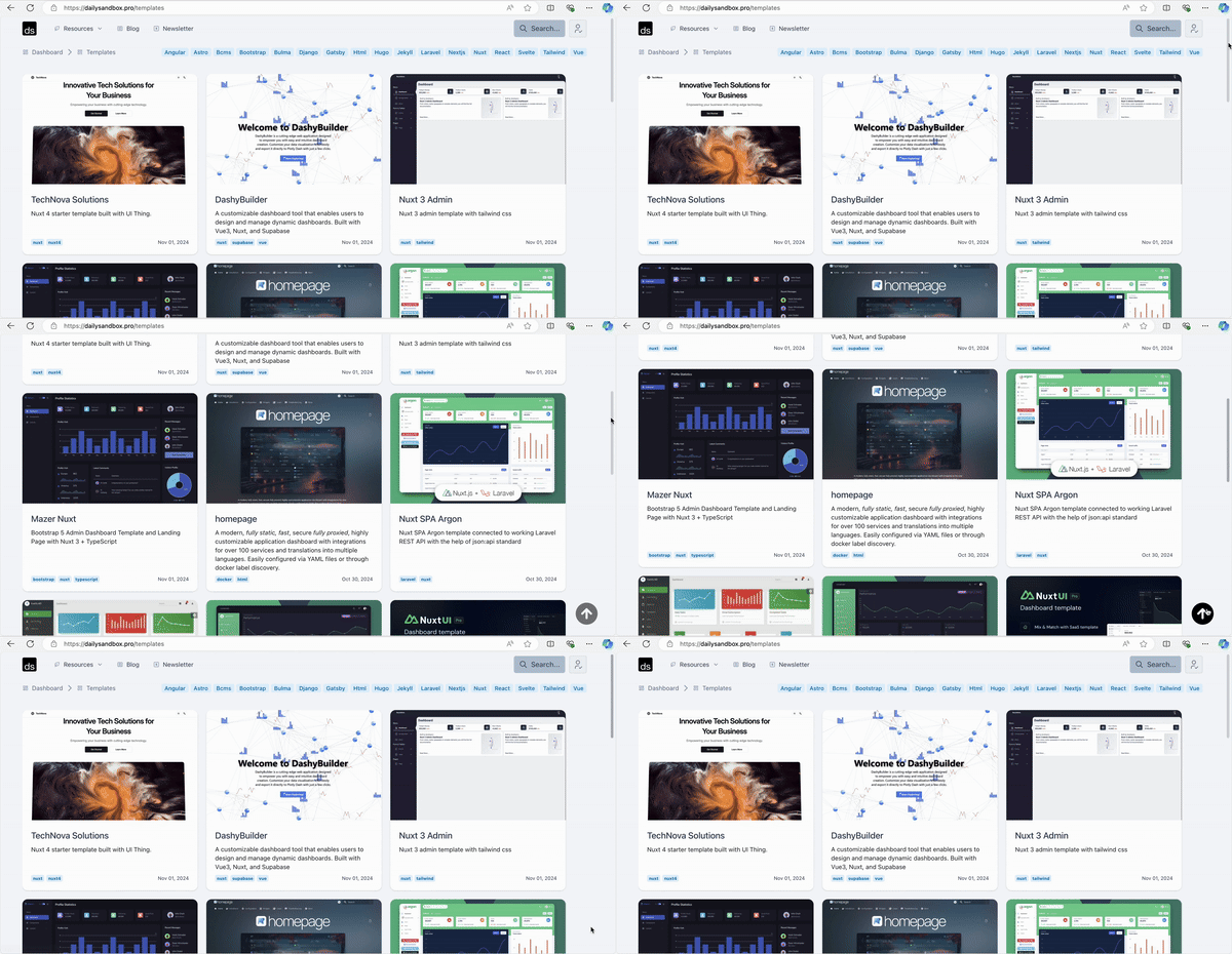
Adding a "Back-to-Top" button to your Vue 3 app can significantly improve user experience, especially on long pages. This button remains hidden until the user scrolls down a specified distance, then smoothly scrolls them back to the top when clicked.
What Makes It Great?
- Scroll Detection: Monitors
window.scrollYto determine when the button should appear. - Smooth Scrolling: Enhances navigation by animating the scroll action.
- Modern UI: Sleek and minimalistic design that integrates seamlessly into any application.
Here’s how to build it.
The Code
Script Setup
The script uses Vue's Composition API to manage the button's visibility and handle the scroll behavior.
<script setup>
const isVisible = ref(false); // Tracks the button's visibility

// Function to check scroll position and toggle visibility
const handleScroll = () => {
	isVisible.value = window.scrollY > 200; // Show when scrolled > 200px
};

// Smoothly scroll to the top of the page
const scrollToTop = () => {
	window.scrollTo({ top: 0, behavior: 'smooth' });
};

// Add and remove scroll event listeners
onMounted(() => {
	window.addEventListener('scroll', handleScroll);
});

onBeforeUnmount(() => {
	window.removeEventListener('scroll', handleScroll);
});
</script>
Template
The button is conditionally displayed using v-show and styled with an SVG icon to represent the back-to-top functionality.
<template>
	<a v-show="isVisible" href="#" class="back-to-top-control" @click.prevent="scrollToTop">
		<svg xmlns="http://www.w3.org/2000/svg" width="24" height="24" viewBox="0 0 24 24" stroke-width="1" stroke="currentColor" fill="none" stroke-linecap="round" stroke-linejoin="round">
			<path stroke="none" d="M0 0h24v24H0z" fill="none" />
			<path d="M17 3.34a10 10 0 1 1 -14.995 8.984l-.005 -.324l.005 -.324a10 10 0 0 1 14.995 -8.336zm-4.98 3.66l-.163 .01l-.086 .016l-.142 .045l-.113 .054l-.07 .043l-.095 .071l-.058 .054l-4 4l-.083 .094a1 1 0 0 0 1.497 1.32l2.293 -2.293v5.586l.007 .117a1 1 0 0 0 1.993 -.117v-5.585l2.293 2.292l.094 .083a1 1 0 0 0 1.32 -1.497l-4 -4l-.082 -.073l-.089 -.064l-.113 -.062l-.081 -.034l-.113 -.034l-.112 -.02l-.098 -.006z" stroke-width="0" fill="currentColor" />
		</svg>
	</a>
</template>
v-show: Ensures the button is rendered but hidden when not needed.- SVG Icon: Enhances the button’s visual appeal.
2228+ FREE RESOURCES FOR DEVELOPERS!! ❤️😍🥳 (updated daily)
1400+ Free HTML Templates
359+ Free News Articles
69+ Free AI Prompts
323+ Free Code Libraries
52+ Free Code Snippets & Boilerplates for Node, Nuxt, Vue, and more!
25+ Free Open Source Icon Libraries
Visit dailysandbox.pro for free access to a treasure trove of resources!
Styles
The button’s fixed position ensures it remains in view as the user scrolls. Hover effects provide a polished touch.
<style lang="less" scoped>
.back-to-top-control {
	display: flex;
	align-items: center;
	justify-content: center;
	position: fixed;
	bottom: 20px;
	right: 20px;
	z-index: 1000;
	width: 60px;
	height: 60px;
	color: black;
	background-color: white;
	border-radius: 50%;
	box-shadow: 0 4px 8px rgba(0, 0, 0, 0.2);
	opacity: 0.5;
	transition: opacity 0.3s ease;

	&:hover {
		opacity: 1;
	}

	> svg {
		width: 24px;
		height: 24px;
	}
}
</style>
How It Works
- Scroll Detection: A scroll event listener checks if the user has scrolled more than 200 pixels. If true,
isVisiblebecomestrue, displaying the button. - Smooth Scroll: Clicking the button triggers the
scrollToTopfunction, which useswindow.scrollTowith abehaviorofsmooth. - Lifecycle Hooks:
onMountedandonBeforeUnmountensure that event listeners are properly managed to prevent memory leaks.
For more tips on web development, check out DailySandbox and sign up for our free newsletter to stay ahead of the curve!


Comments ()